
Product and category context
We start with what the product does, who must trust it, what the business can credibly own and which constraints the eventual interface must respect.
Supporting capability · Design & brand systems
We research the category, find a visual territory worth owning and carry it through identity, product UX and the shipped interface. No generic template. No handoff gap between a beautiful deck and what customers actually use.
Position · 001
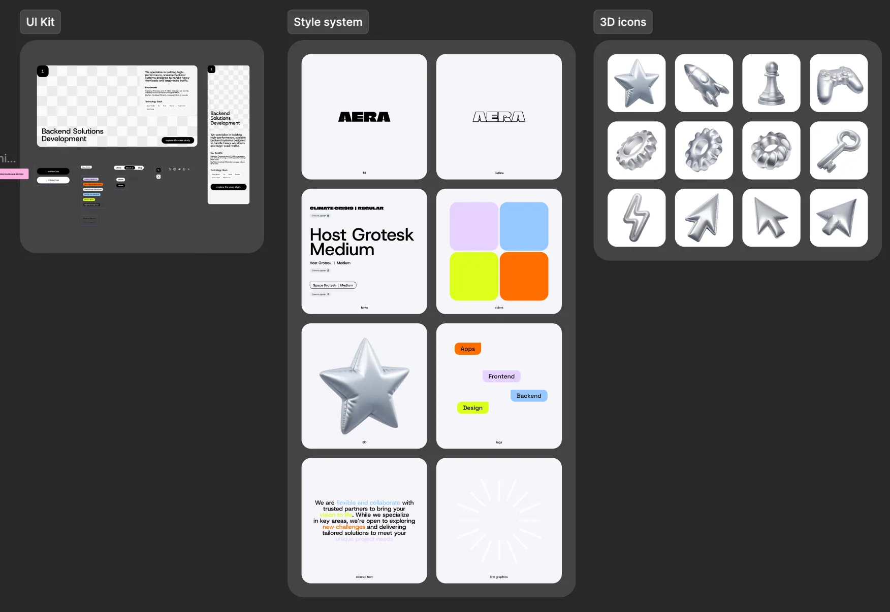
Many digital products end up in one of two places: polished but anonymous, or expressive but impossible to run consistently. We design for the space in between — distinctive enough to be recognized and systematic enough to support real content, real workflows and future releases.
Design is a supporting capability inside H Product Studio, not a decorative add-on. The people shaping the brand work alongside the people responsible for architecture and implementation, so the concept is tested against responsive behavior, content operations and component constraints early.
Process · 002
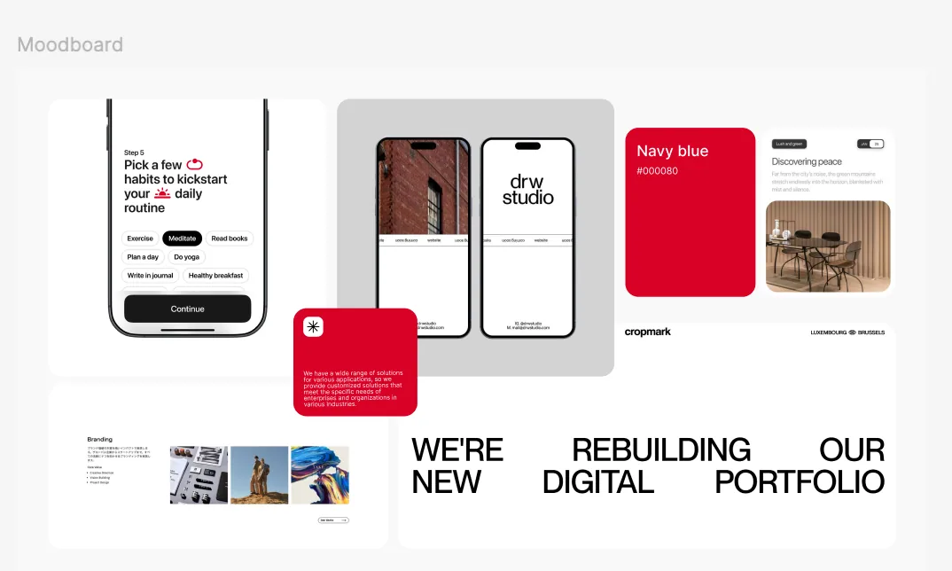
Research is useful only when it changes a decision. We keep the process concrete: understand the product, map the field, explore a small number of territories and turn the selected one into a system that can ship.
We start with what the product does, who must trust it, what the business can credibly own and which constraints the eventual interface must respect.
We map repeated claims, visual conventions, interface patterns and category sameness. The point is not to imitate competitors — it is to see what must be familiar and where the brand can be unmistakably different.
We turn strategy into a small set of visual directions: typography, color, image behavior, composition, texture, motion and voice. Each route has a reason, not just a vibe.
The selected direction becomes a working system across identity, content, responsive UX/UI, components and production assets — with source files and rules the client can continue using.
Explore · 003
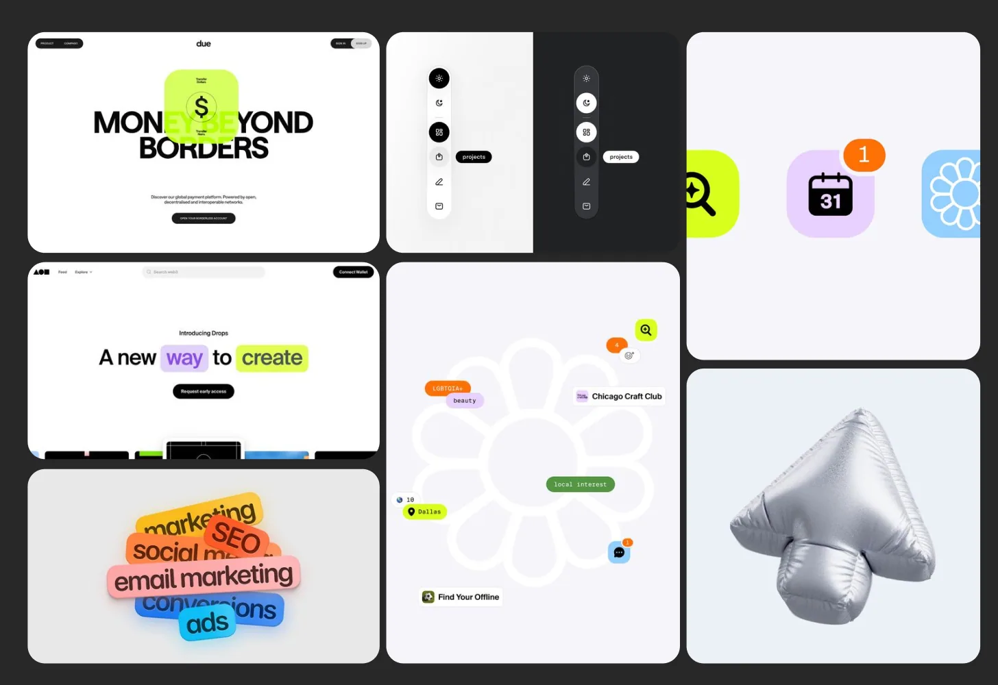
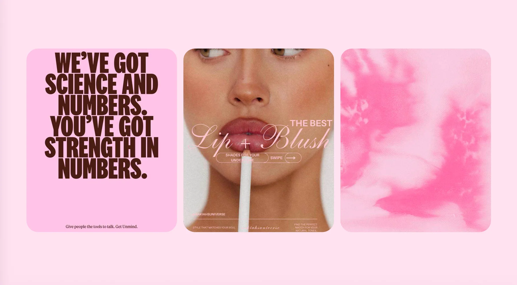
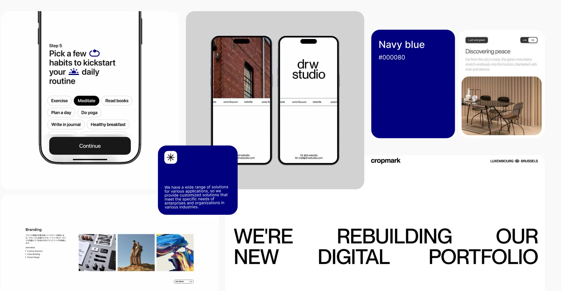
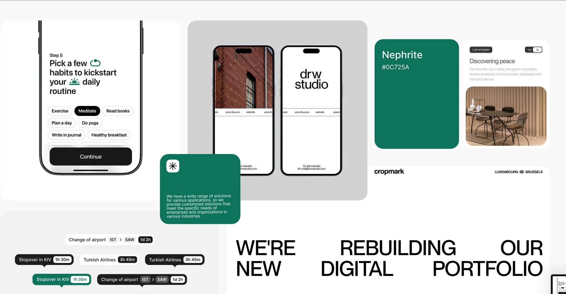
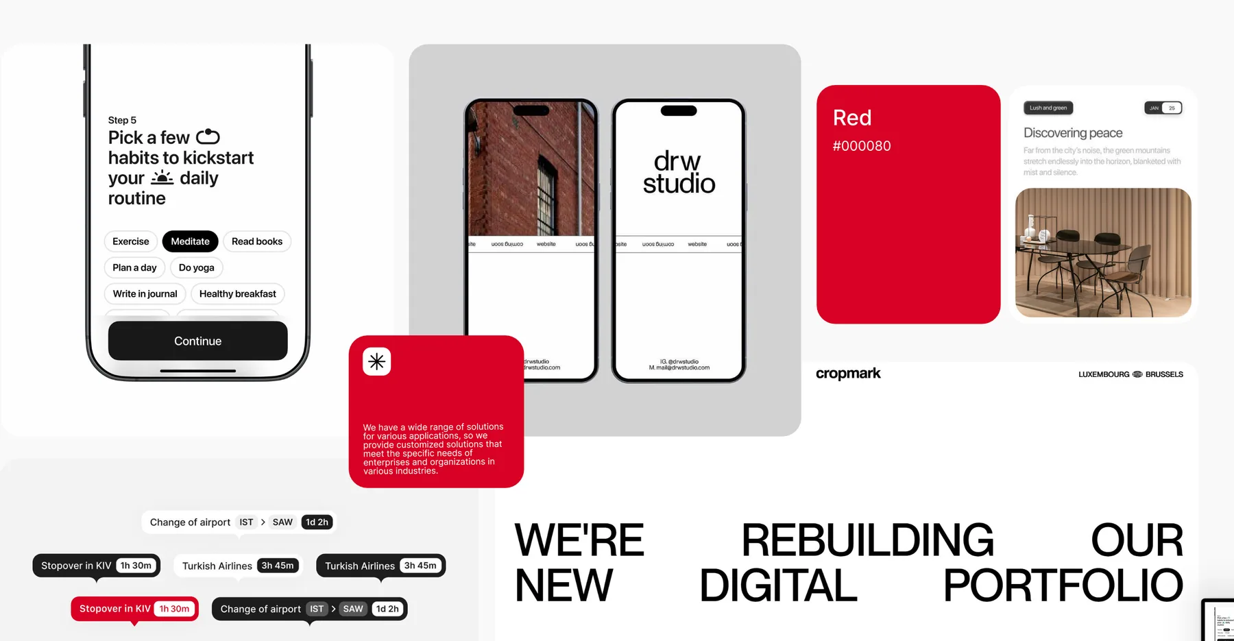
Moodboards contain reference imagery used to discuss a direction. The finished identity and interface are original project outputs shown in the sections below.
System · 004
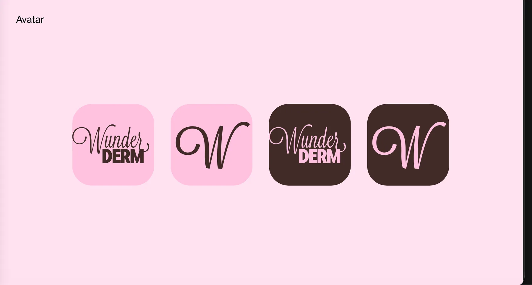
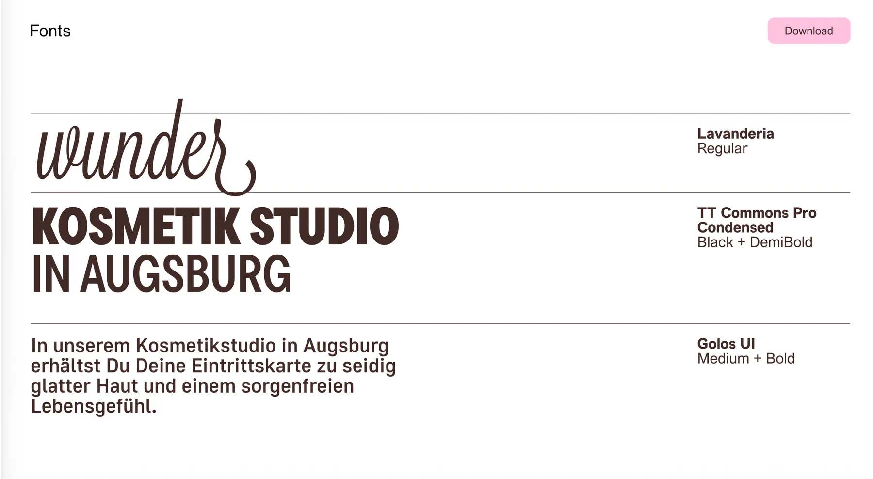
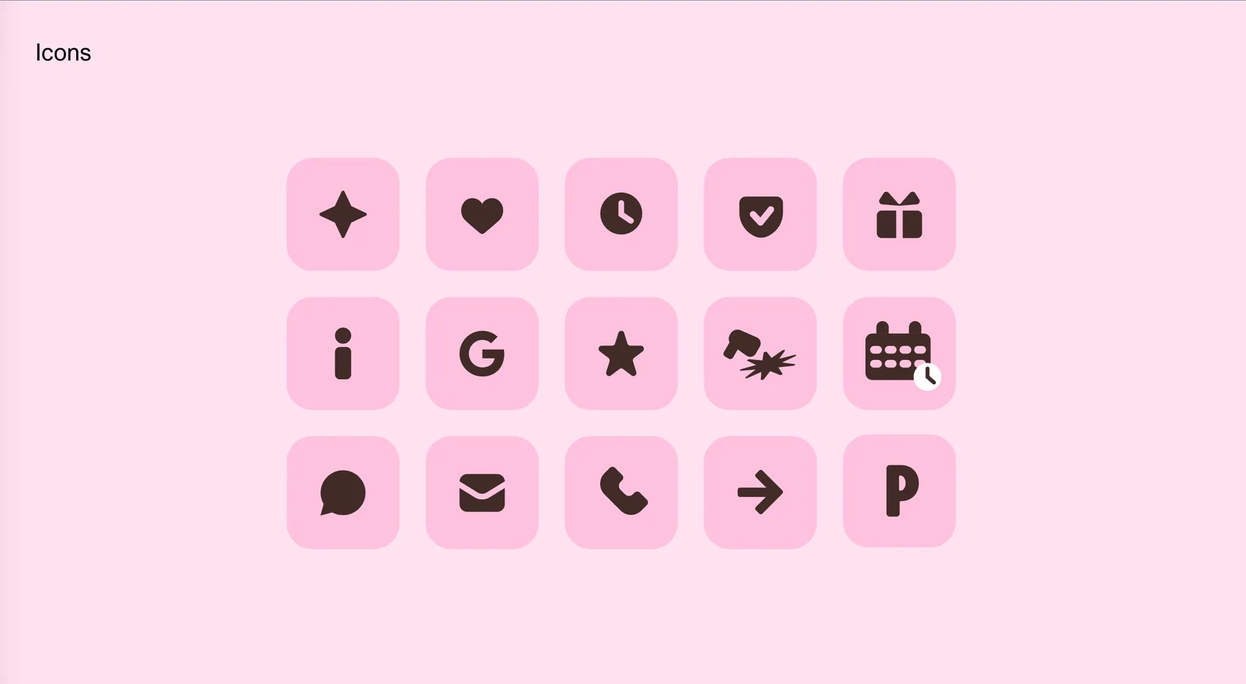
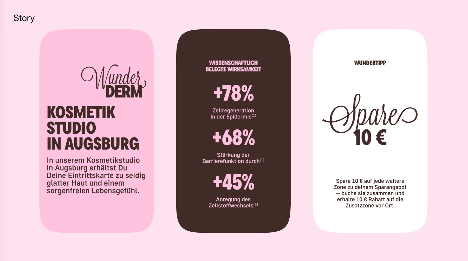
The output is more than a logo. Typography, color, image behavior, icons, composition and content patterns need enough character to feel owned — and enough rules to stay coherent after launch.

Product · 005
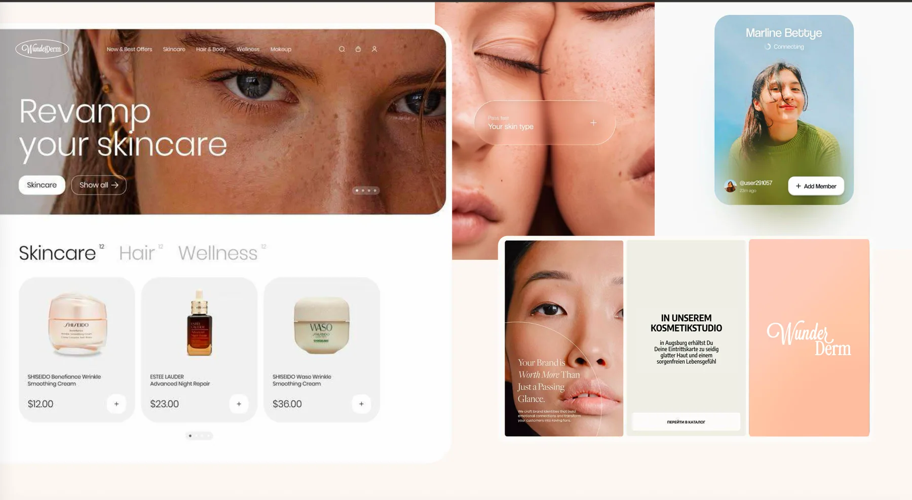
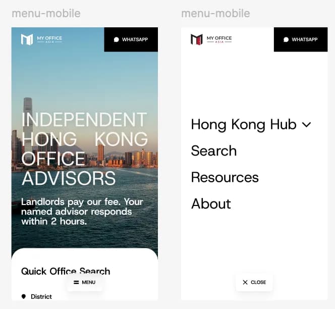
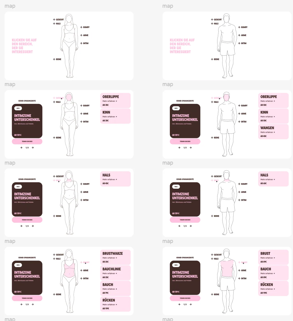
A visual direction has to survive navigation, dense data, edge cases, mobile breakpoints and changing content. We resolve those conditions in Figma with the same component logic the production team will need.
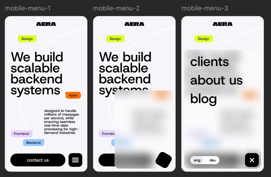
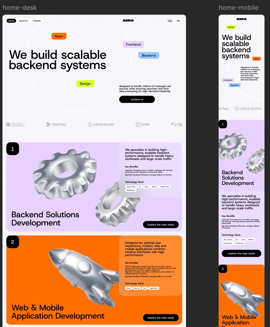
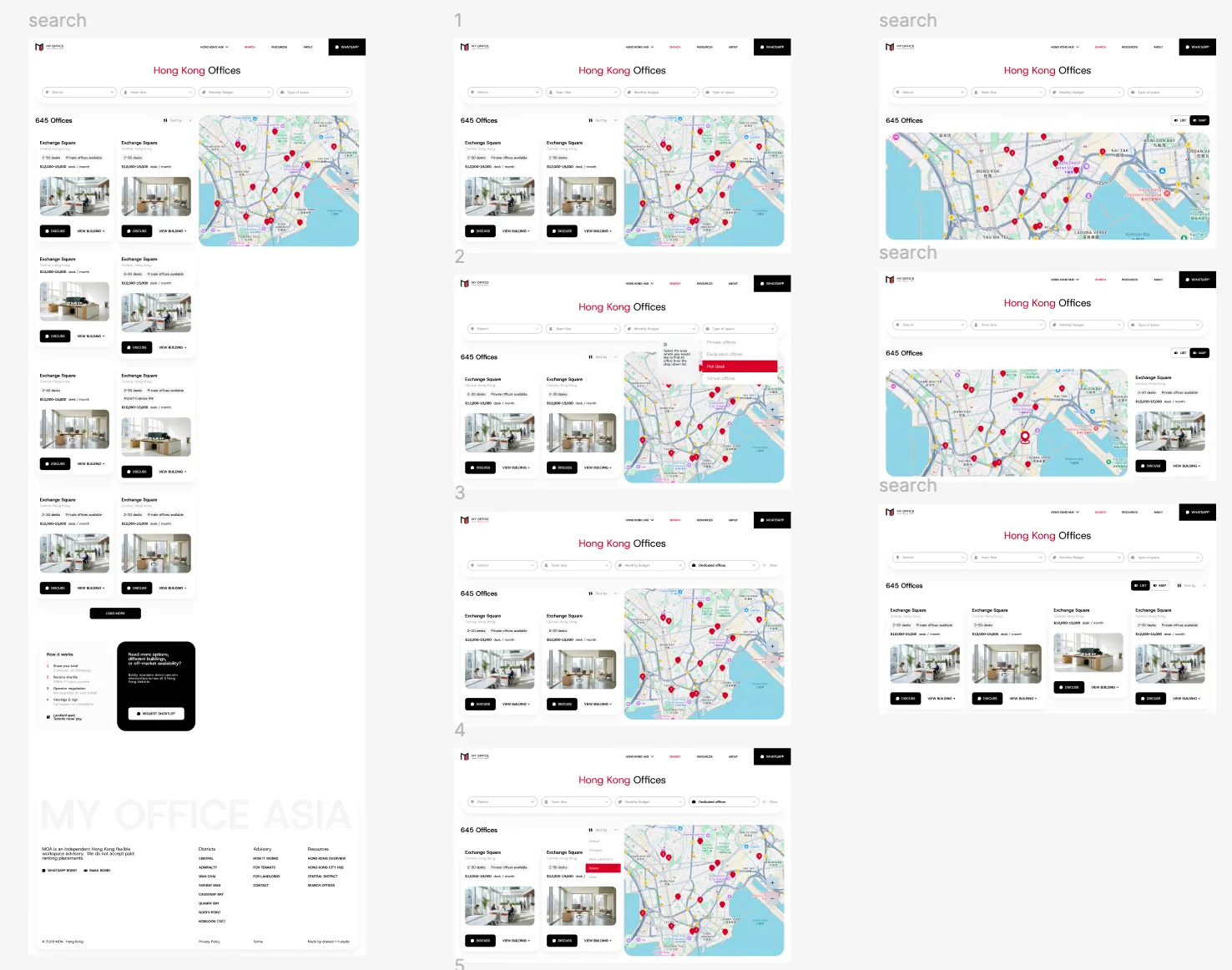
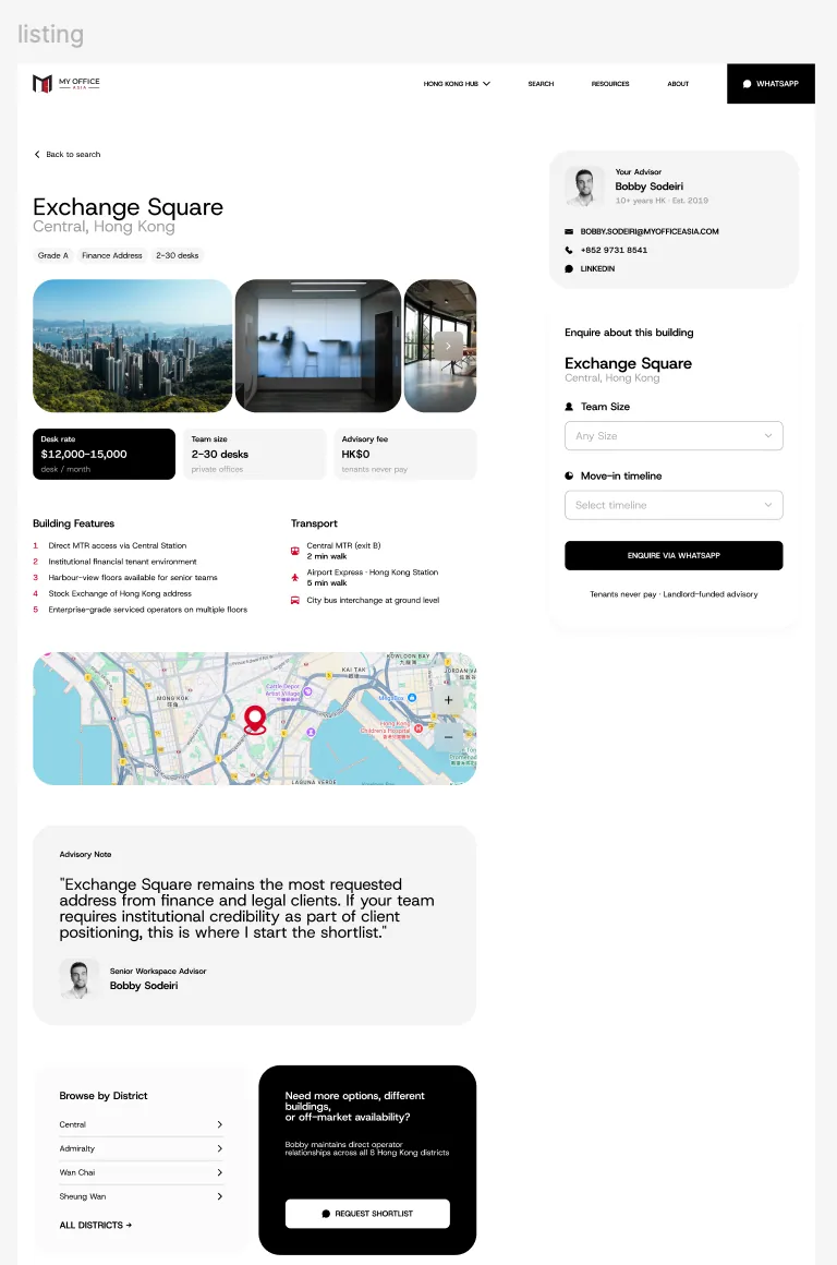
Our difference · 006
We do not begin with a fashionable agency style and pour every client into it. The work starts with the product and the category, then becomes a visual system specific enough to be remembered.
Creative ambition is not an excuse for fragile implementation. The concept must still work in reusable components, editable content, responsive states and the client’s own repository. Distinction and maintainability are designed together.
Selected proof · 007
The system changes because the product, audience and category change. The process stays disciplined: understand, differentiate, systematize and ship.
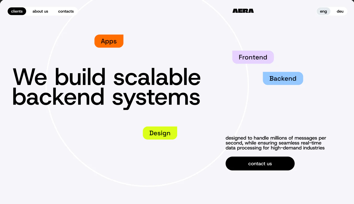
Digital product studio
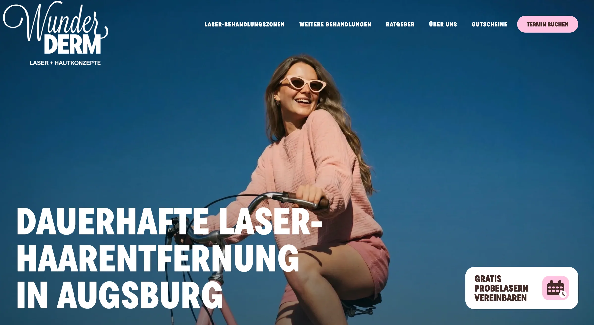
Beauty and treatment platform
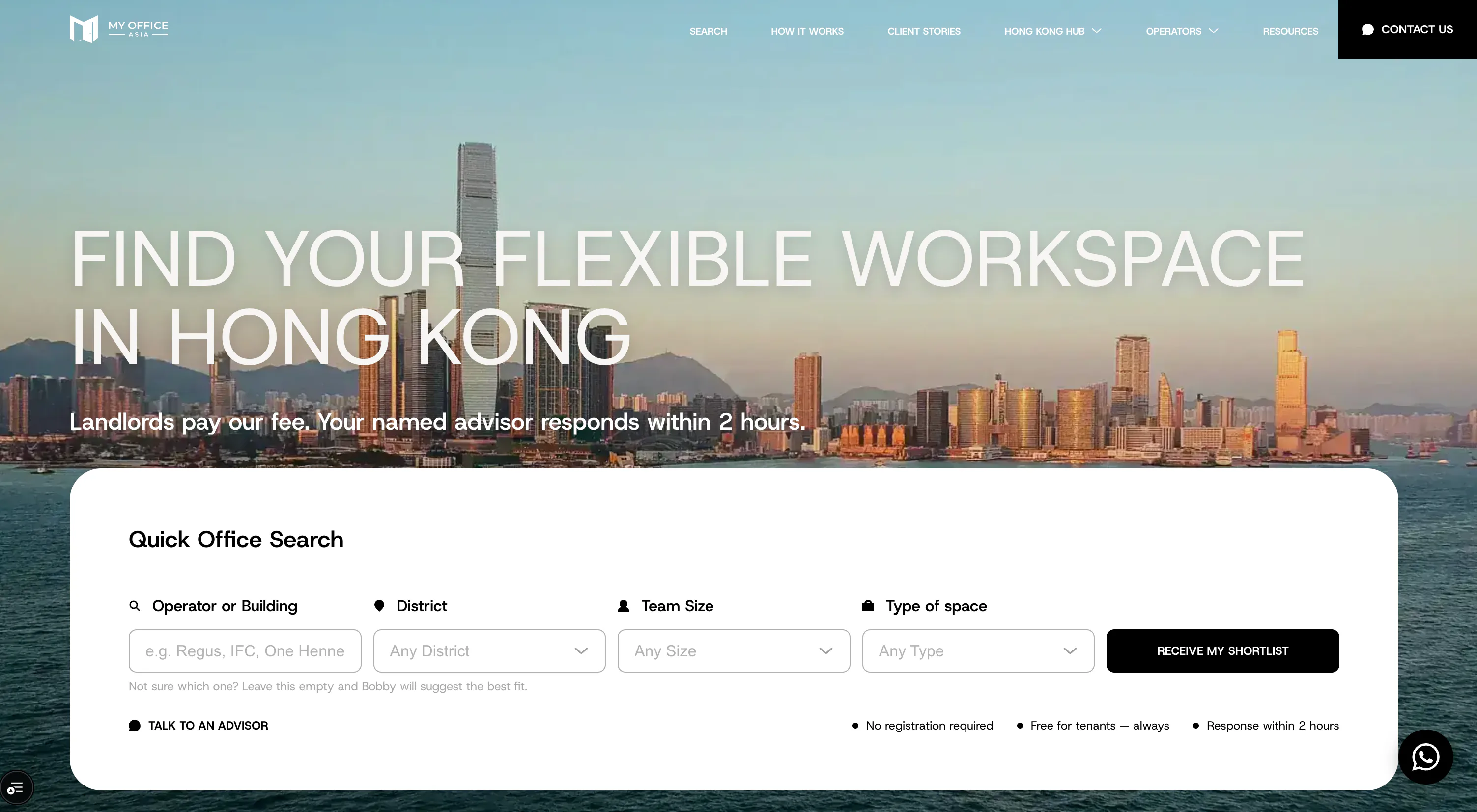
Commercial property marketplace
Scope · 008
Design and branding can sit inside a new build, a product takeover, a website relaunch or a focused identity refresh. We define the boundary before work starts and keep it connected to the technical delivery plan.
From an inherited codebase or a new product idea to long-term delivery — we define, build, modernize and operate software your team can truly own.