Product
AERA · multidisciplinary digital studio
Focus
Positioning · services · work · lead conversion
Delivery
Brand system → UX/UI → responsive production website
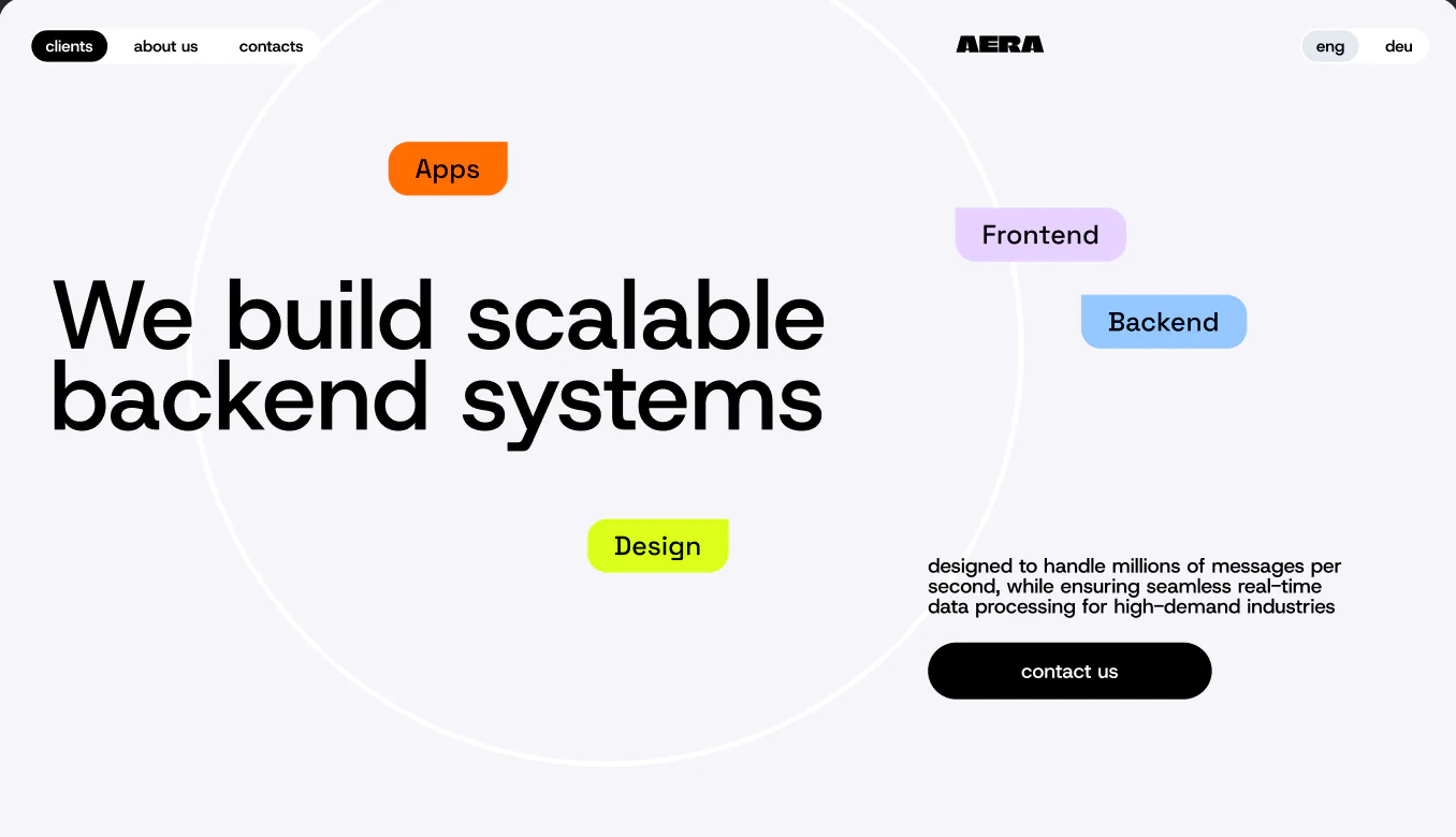
A studio website should demonstrate the work before it explains the offer
AERA brings backend engineering, web and mobile delivery, product design, DevOps and systems integration under one roof. The central UX problem was not a shortage of services. It was helping a buyer understand how those disciplines connect — and making the studio feel specific rather than like another agency assembled from generic technology claims.
The website was structured as a product in its own right. A concise homepage sets the promise. Capability pages add depth. The work archive supplies proof. Team and contact flows answer the trust questions that appear before a serious project starts.
A digital identity built from reusable behavior
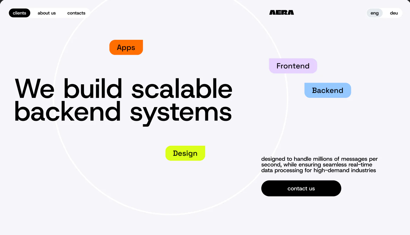
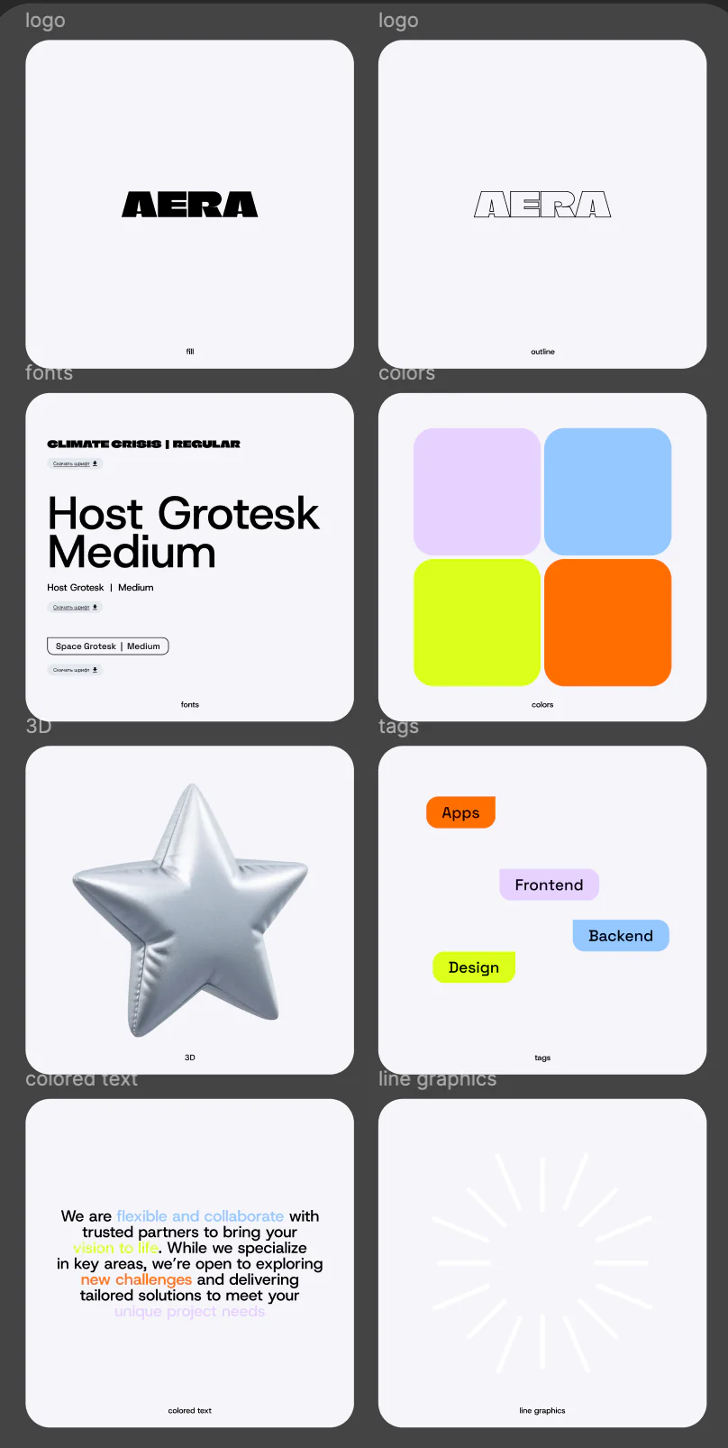
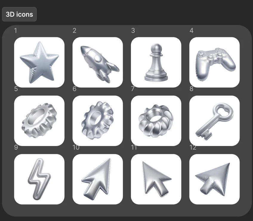
The AERA wordmark anchors a deliberately energetic system: oversized Host Grotesk typography, a compact display face, silver 3D objects and four functional accents. Color is not decoration added at the end. It organizes services, tags, highlighted phrases and transitions between dense technical content.
- Filled and outlined wordmark variants for light surfaces.
- A shared typographic hierarchy for marketing, case studies and interface labels.
- Service-specific accent colors that continue across cards, tags and detail pages.
- A reusable 3D image family that keeps the site recognizable without repeating one hero treatment.
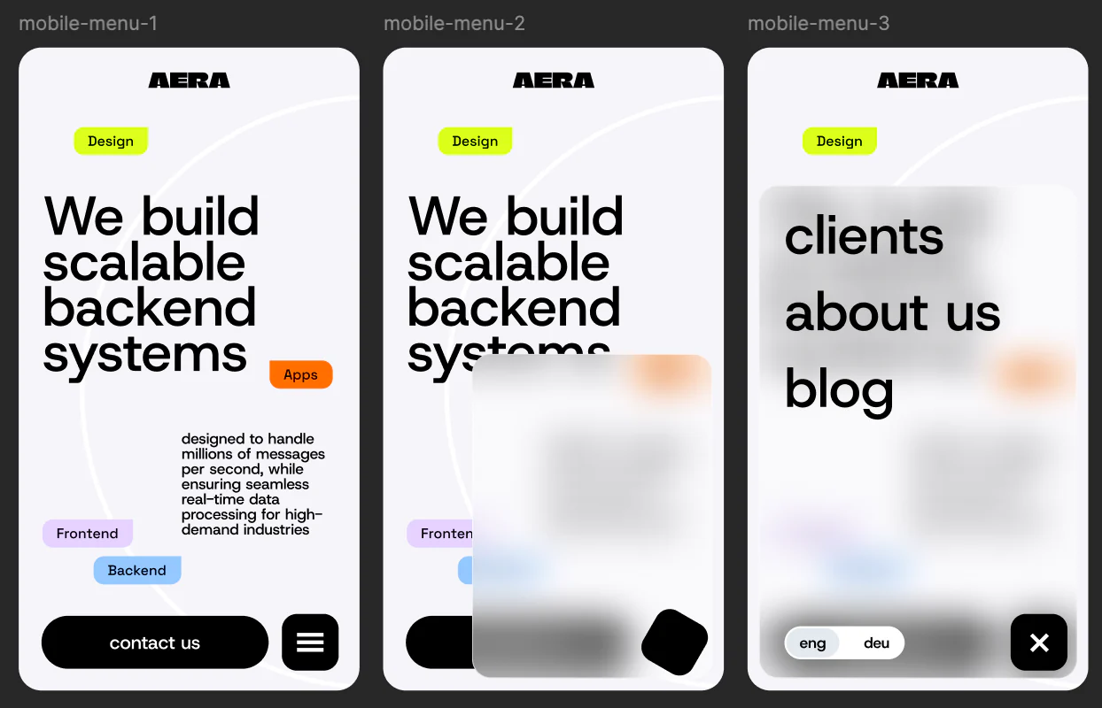
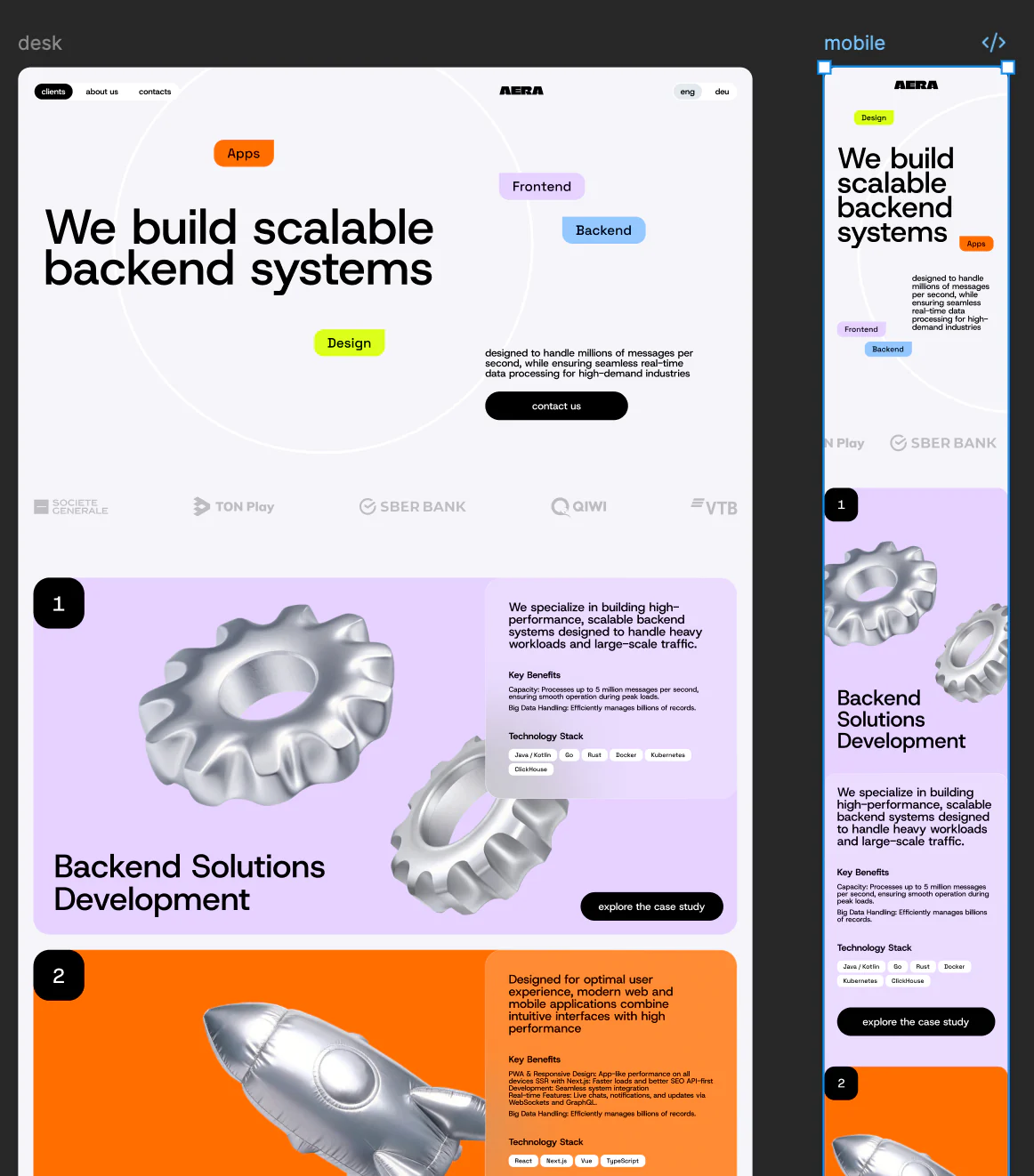
Responsive design was solved at the content level
The desktop composition uses scale, open space and floating labels to make the studio feel confident. Mobile could not simply shrink that canvas. Headlines reflow, tags move closer to the claims they qualify, descriptive copy becomes more compact and navigation turns into a tactile overlay with a clear close state.
Designing both breakpoints together also exposed which content was genuinely important. The result is a responsive system with the same voice on every screen, not a desktop portfolio followed by a compressed mobile afterthought.
One service architecture, six distinct capability stories
Each capability plate answers the same buyer questions: what the studio does, why it matters, which technologies are relevant and where to see proof. Shared structure keeps the experience predictable; color, objects and composition give each discipline its own character.
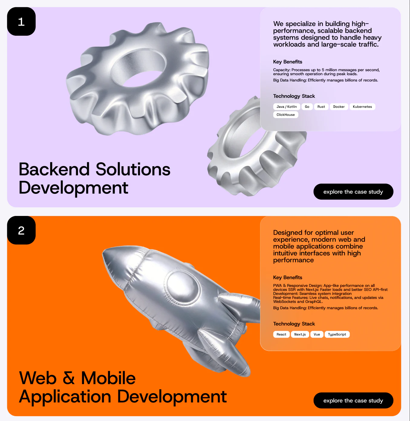
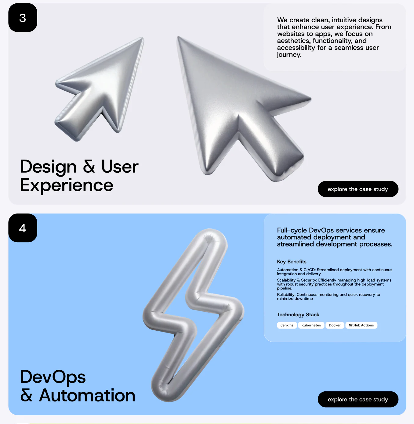
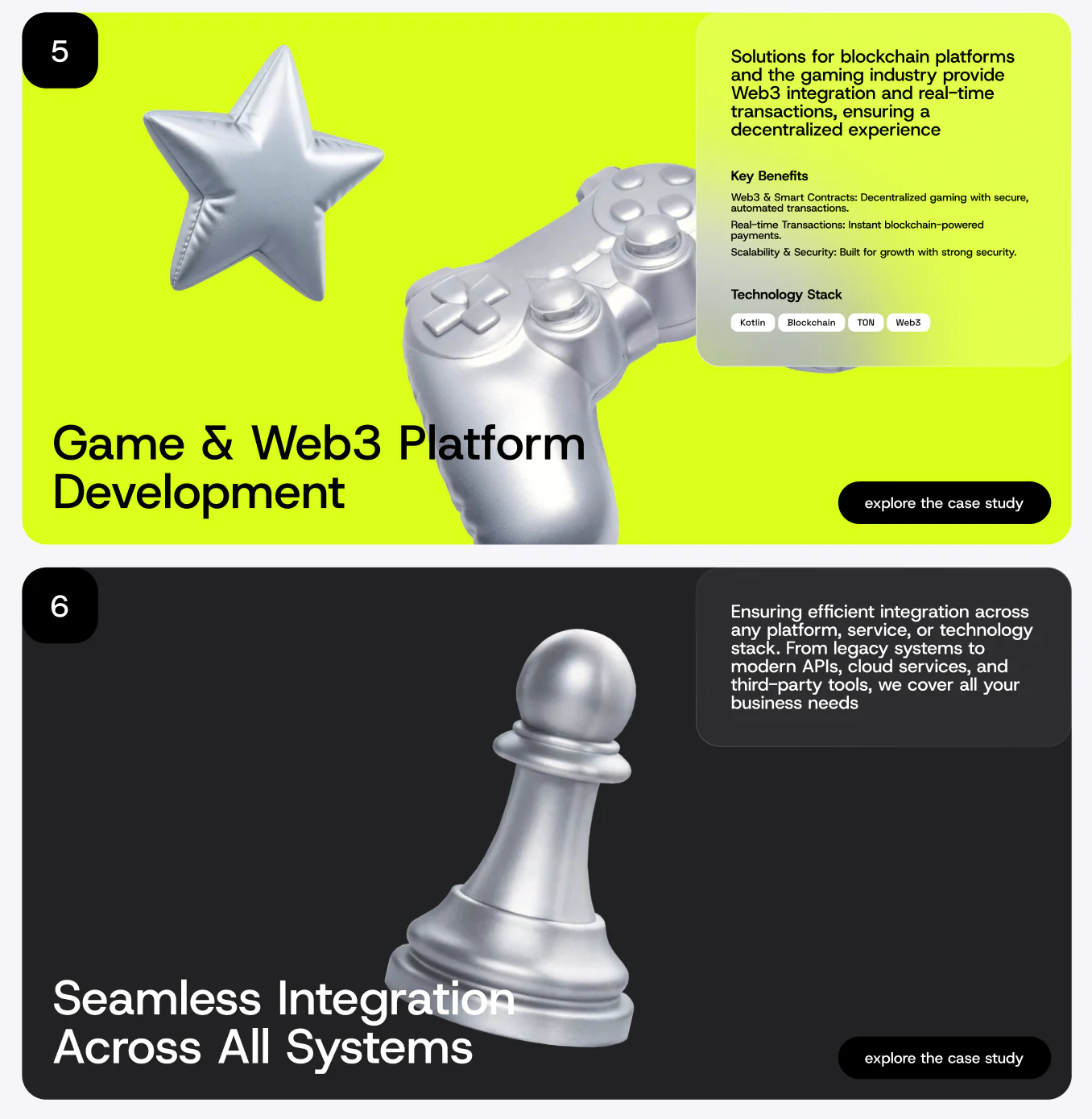
Trust is built through people, process and an easy next step
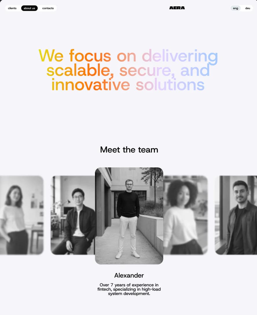
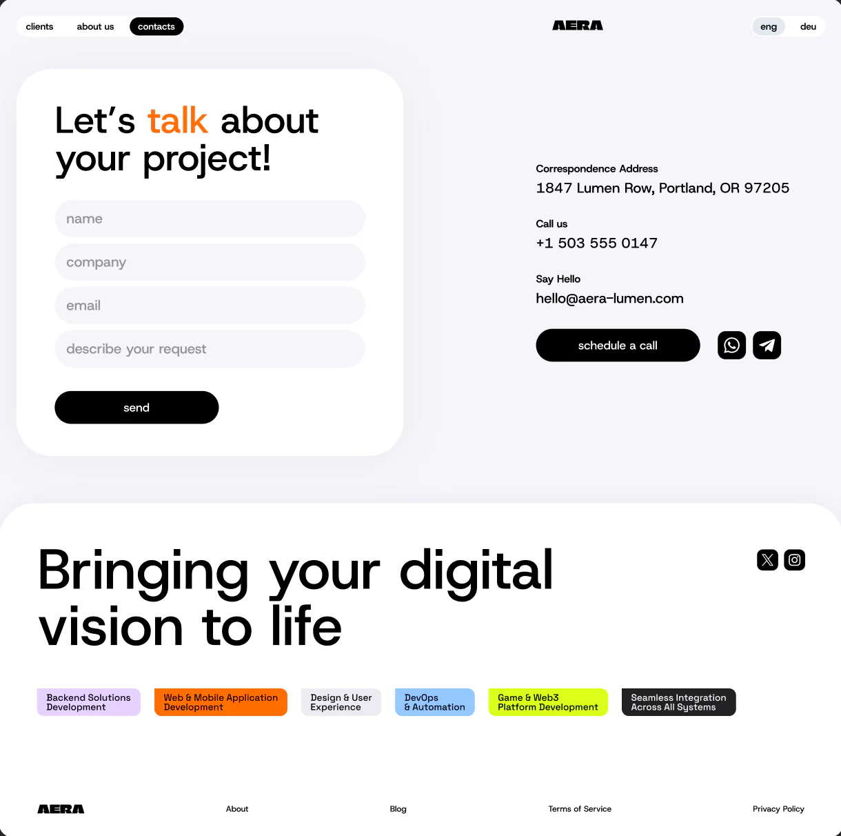
Service pages establish competence, but project owners still need to understand who they will work with and how a conversation starts. The team page uses editorial portraits and short role narratives. The contact experience offers both a structured written brief and a scheduling route without turning the page into a wall of company details.
The proof layer is designed as a publishing system
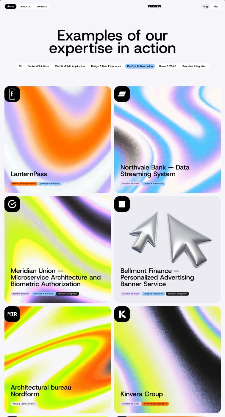
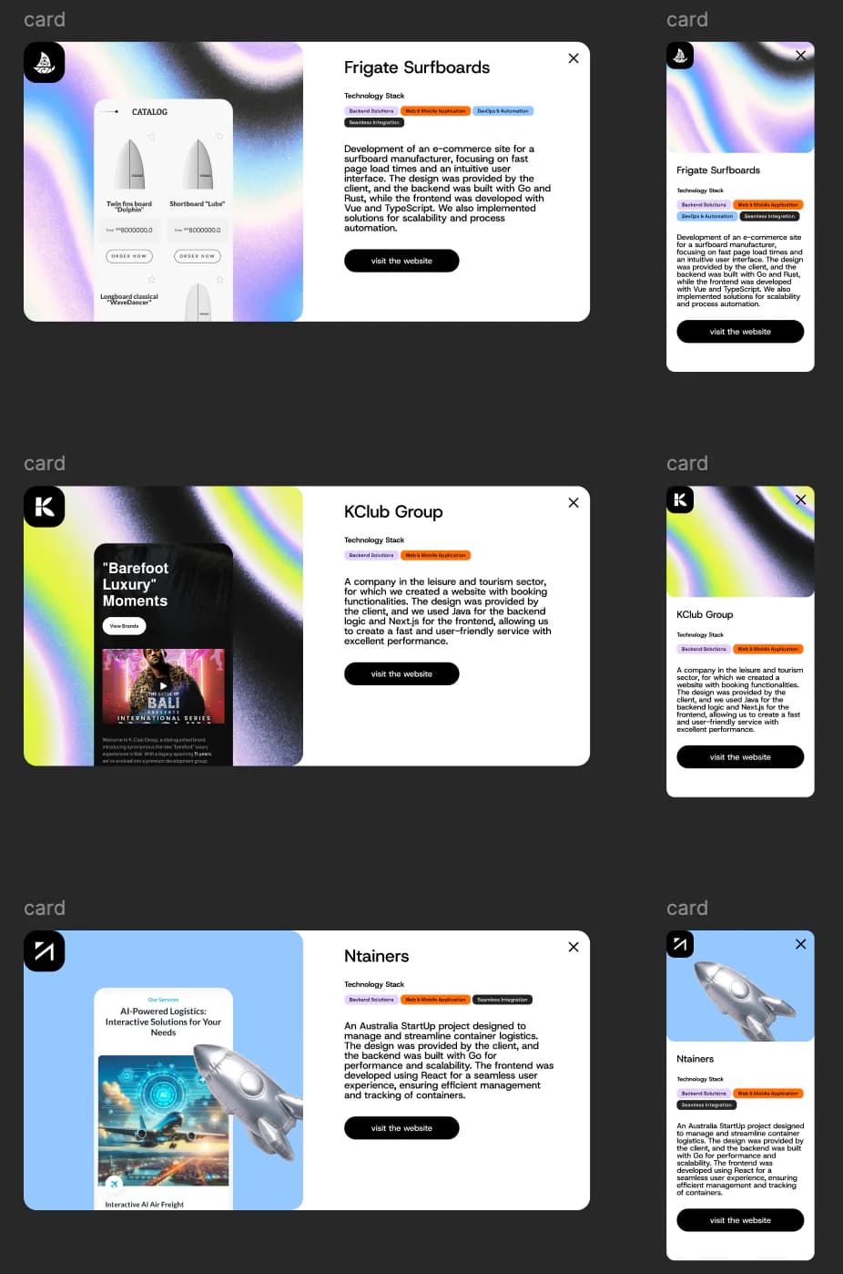
Case studies are not placed in a decorative carousel and then forgotten. The archive supports capability filters, consistent stack tags and distinct cover treatments. Detail cards preserve a stable reading order across desktop and mobile, making it easy to add work without redesigning the portfolio each time.
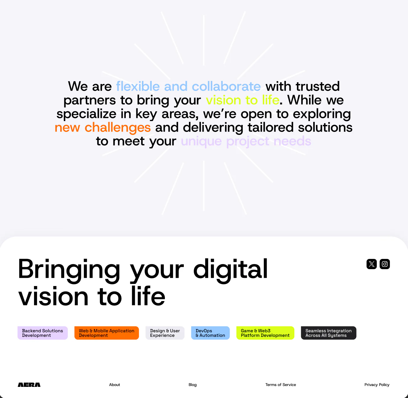
The result: one coherent website instead of disconnected agency pages
AERA now has a production website system that connects identity, positioning, capabilities, people, project proof and inquiry flows. The visual language is expressive enough to be memorable, while the underlying content model remains disciplined enough to grow with new services and case studies.
Clear commercial narrative
The homepage, capability pages and proof archive each answer a different stage of the buyer journey without repeating the same copy.
Reusable visual system
Typography, colors, tags, 3D objects and card patterns create variety without sacrificing consistency.
Responsive by design
Desktop and mobile compositions preserve hierarchy and intent instead of relying on mechanical scaling.
Built to keep publishing
New services, people and case studies can enter a stable information architecture rather than forcing another redesign.
Need a website that can explain complex technical work clearly?
We design and build brand-led digital platforms that connect positioning, service architecture, product proof and lead conversion — without forcing a serious software company into a generic agency template.