Client
WunderDerm · Augsburg, Germany
Industry
Beauty and wellness · local services
Scope
Brand refresh → UX/UI → Next.js + Sanity → SEO migration
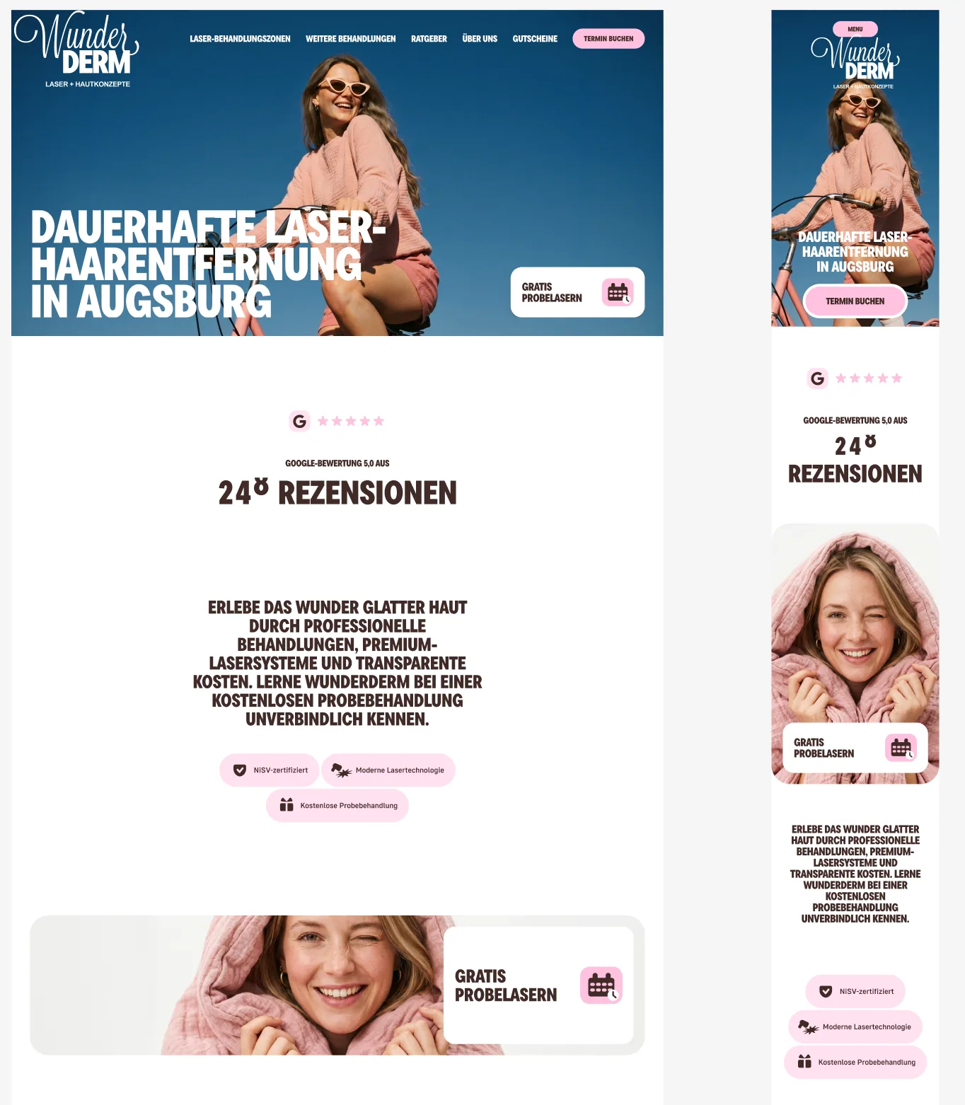
A recognizable brand that needed a new digital chapter
WunderDerm already had a functioning website, an established local presence and a visual identity people recognized. The assignment was not to erase that history. It was to move the business beyond an earlier “beauty laboratory” presentation and build a modern identity around the clearer positioning “Laser + Hautkonzepte.”
The legacy WordPress structure had also grown page by page. Services, treatment zones, pricing, technology explanations and booking paths needed a more deliberate information architecture — one that could feel expressive without making the visitor work to find practical information.
The redesign: personality without the template look
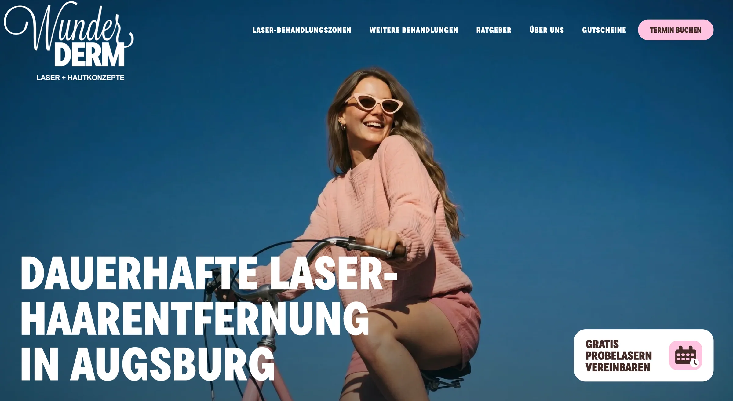
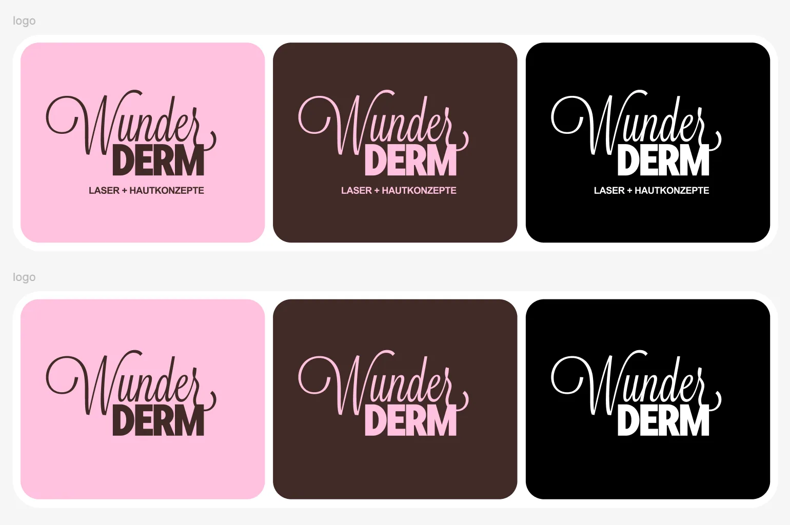
We retained the expressive WunderDerm wordmark, then tightened the hierarchy around it. Deep blue gives the new hero a confident anchor; warm brown, vivid pink and off-white create a flexible system for service pages, cards, navigation and calls to action. A condensed display face and a contrasting script style keep the identity energetic instead of clinical or generic.
- Refined logo lockups and a new “Laser + Hautkonzepte” descriptor.
- A reusable color, typography, spacing and component system.
- Editorial image direction built around warmth, confidence and real movement.
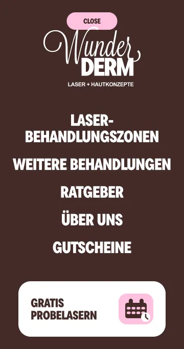
- Desktop and mobile layouts designed together, not adapted at the end.
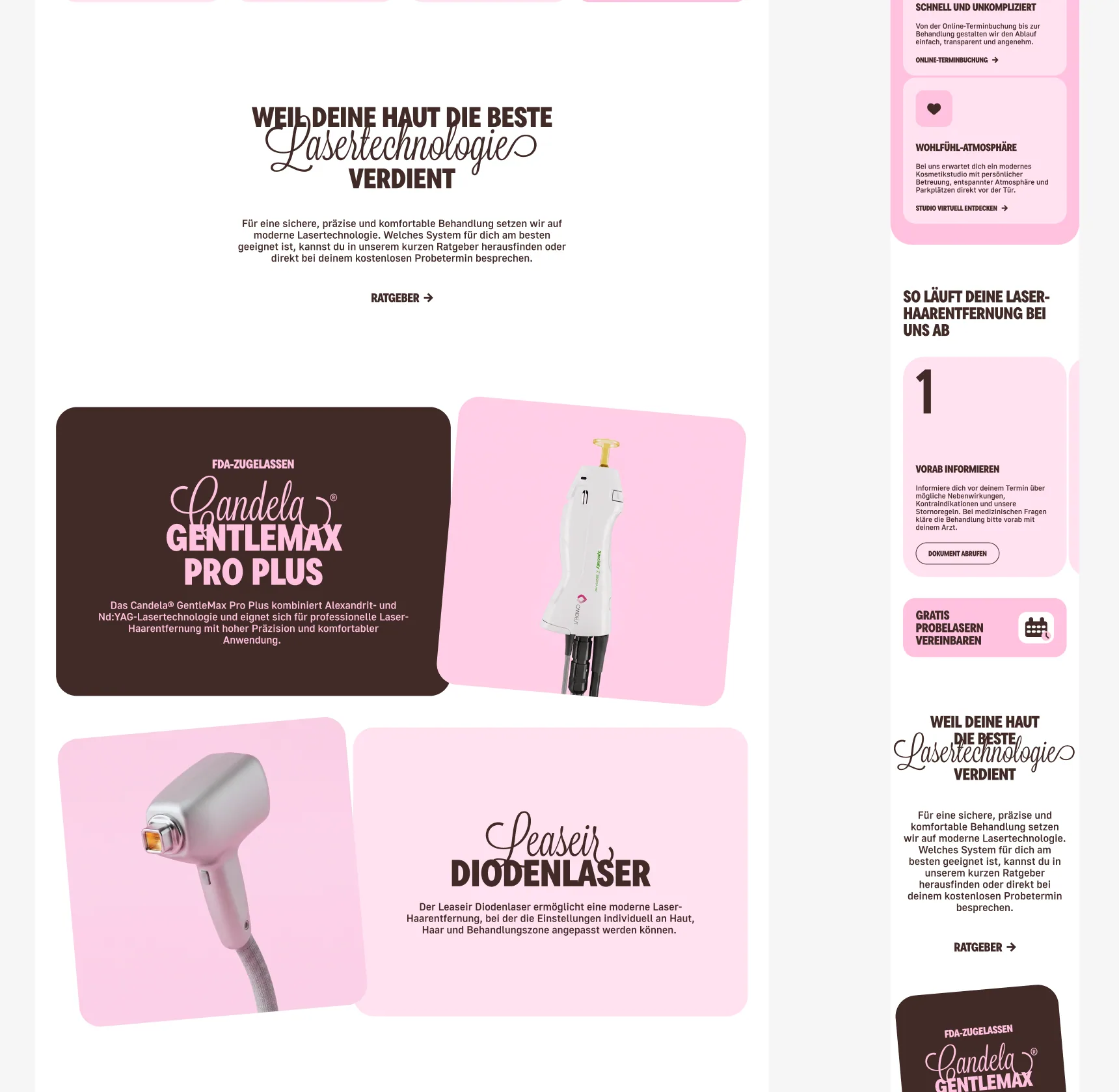
Complex services turned into navigable product flows
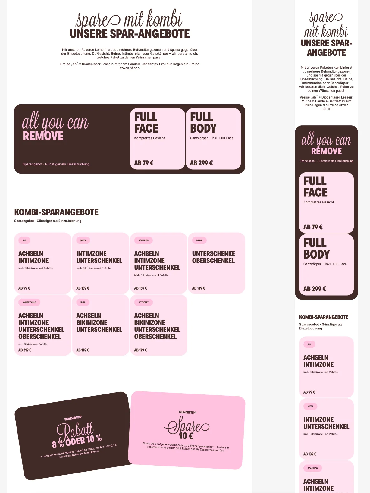
The website has to do more than present a studio. Visitors arrive with a body area, a budget or a technology question in mind. We translated that complexity into connected interfaces: treatment-zone overviews, structured cards, package and price views, contextual explanations and clear booking handoffs.
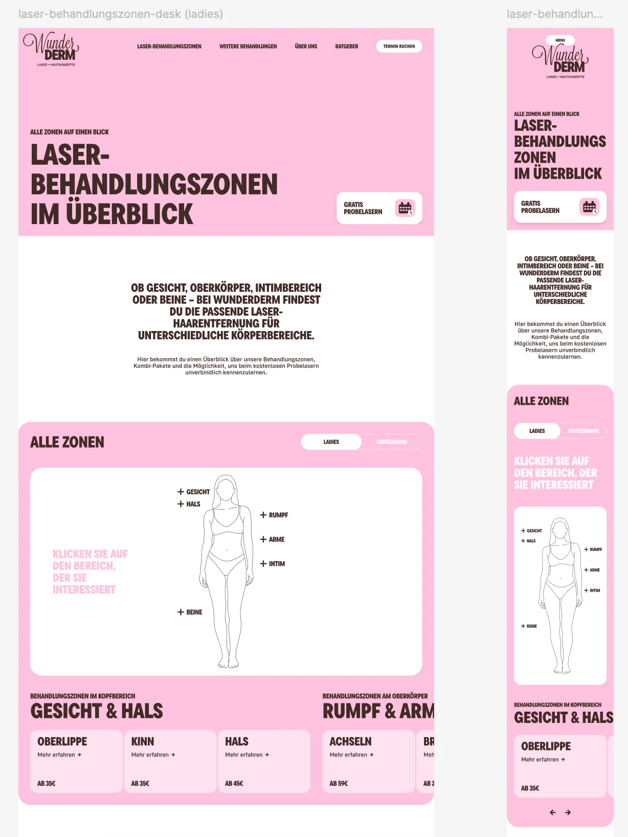
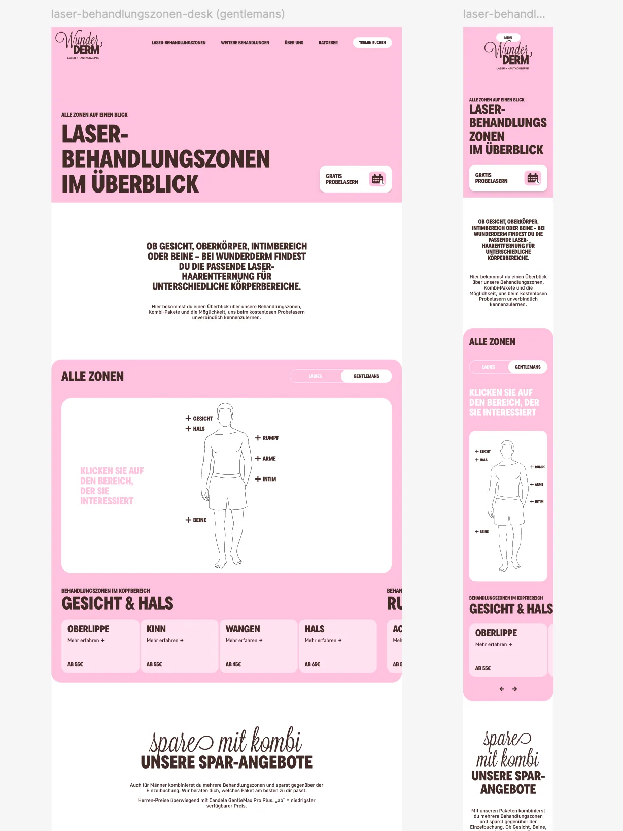
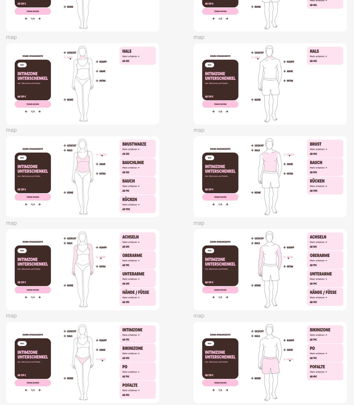
Interactive treatment-zone explorer
A responsive body map lets visitors move between women’s and men’s views, select a region and see the relevant zones without scanning a long undifferentiated price list. The same information model supports focused landing pages and mobile card navigation.
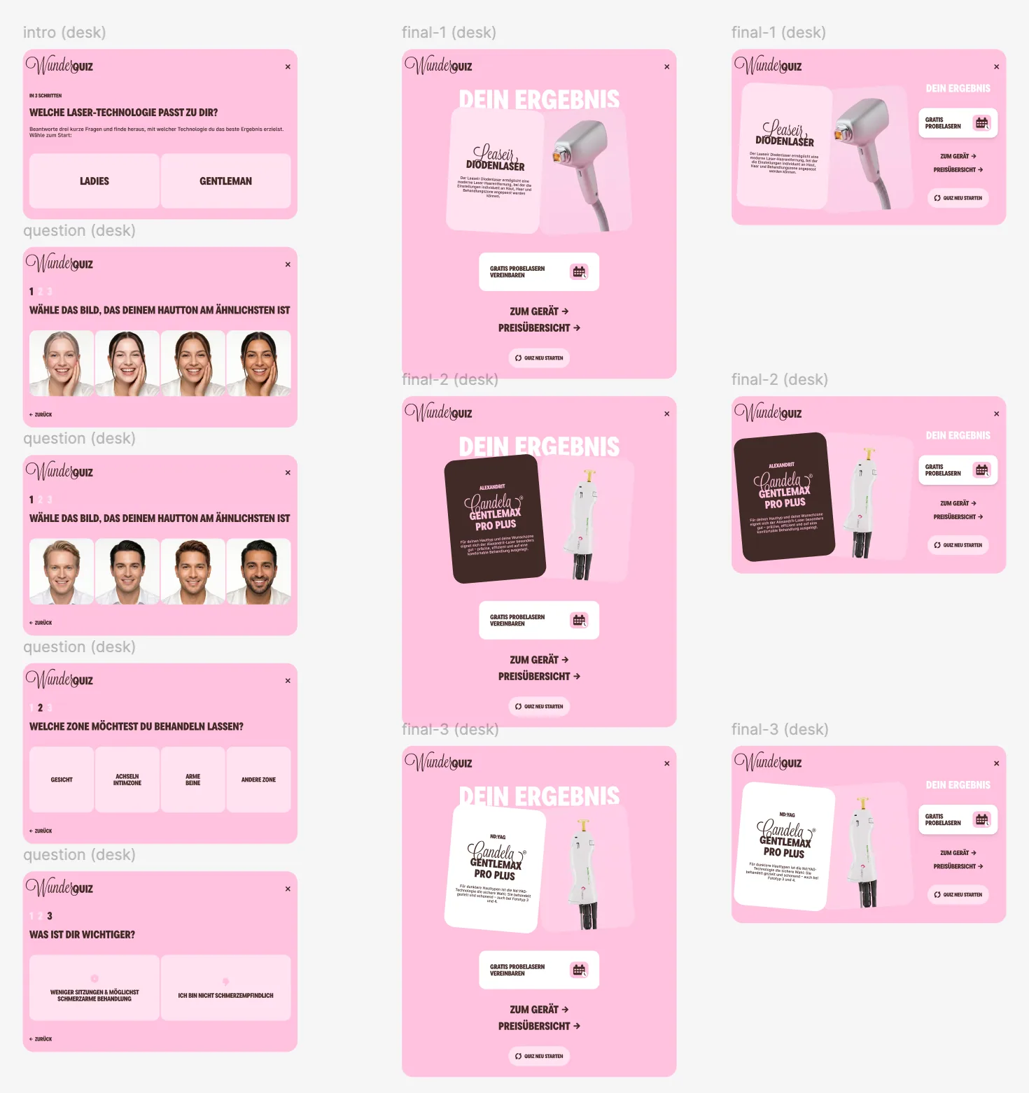
WunderQuiz as guided product orientation
The short WunderQuiz turns a technical comparison into a guided path. It organizes preferences and points visitors toward relevant technology information and pricing; it is not a diagnosis or a substitute for professional consultation.
A second service world, built from the same system
Laser hair removal needed highly structured zone and pricing interfaces. The microneedling page called for a more editorial product story: strong product imagery, a paced explanation of the service, a clear process and practical preparation and aftercare information. The visual character changes, while the underlying typography, spacing, navigation and conversion components stay consistent.
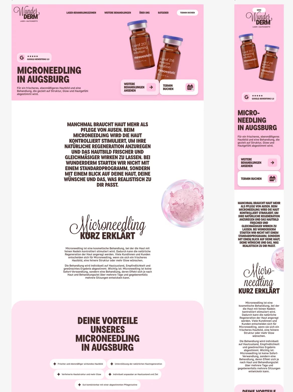
From full Figma layouts to detailed page captures
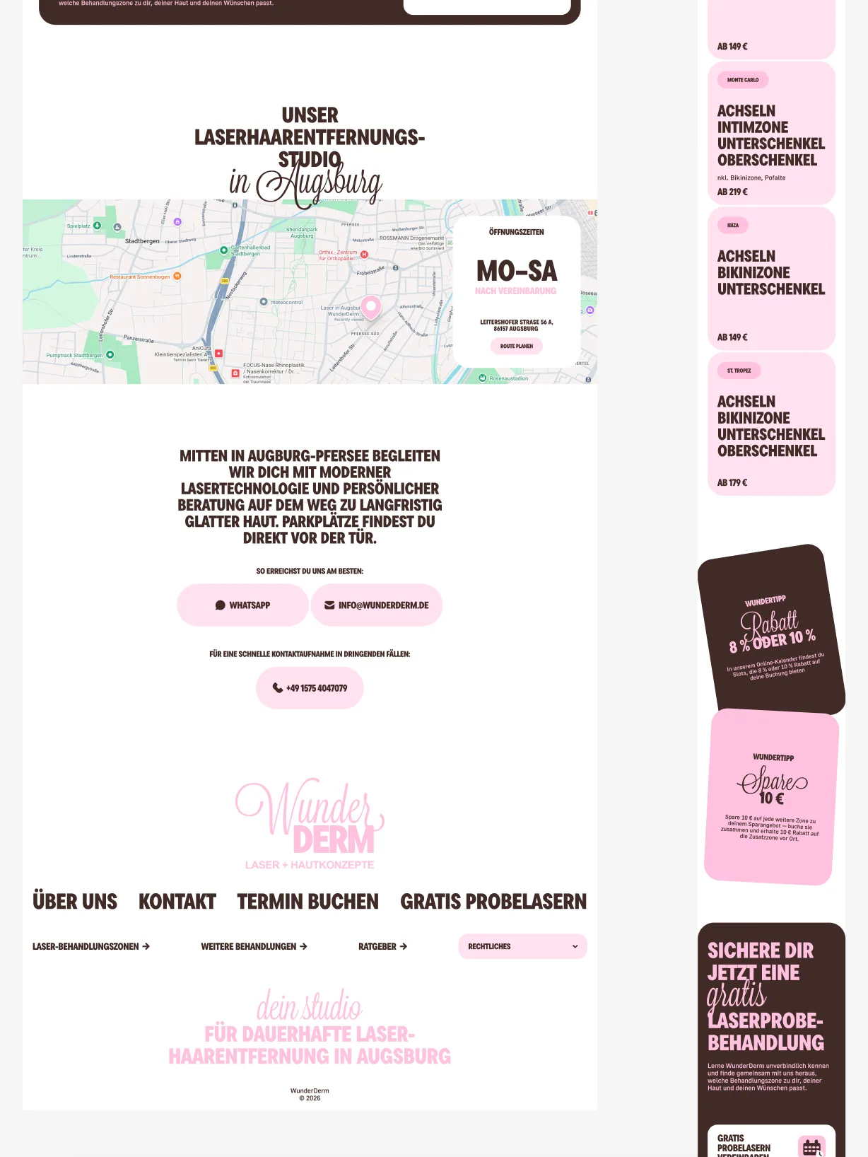
Desktop and mobile compositions were designed together so the narrative survives every breakpoint. These selected page captures show how the experience moves from an offer-led hero into explanation, process and visual storytelling without feeling like a separate website.
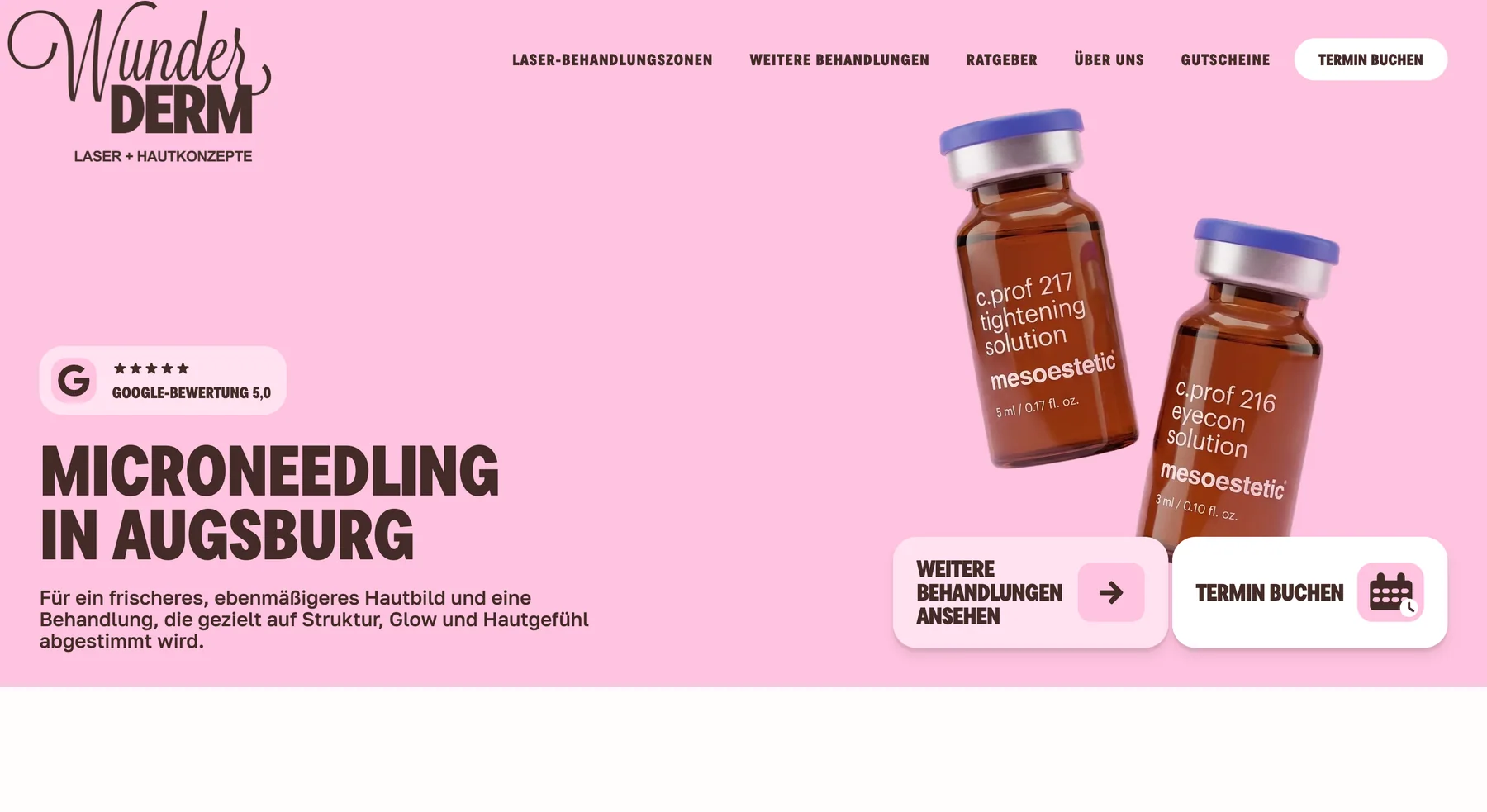
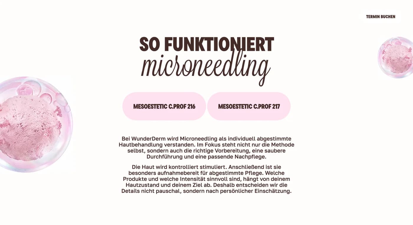
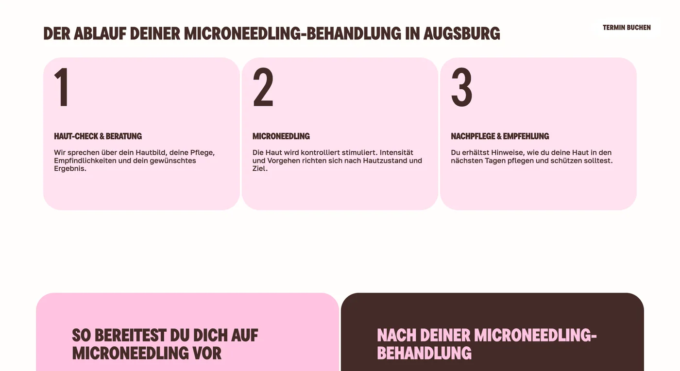
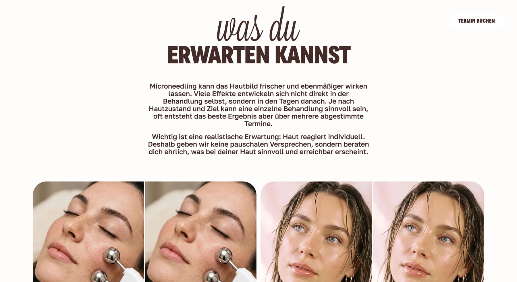
The screens above document interface design, content structure and image direction. Model imagery and on-screen copy are not presented here as evidence of clinical outcomes.
From design system to production-ready platform
The new experience was implemented as a maintainable Next.js application rather than another page-builder theme. The frontend uses the App Router, React and strict TypeScript. Sanity provides structured editorial control for the content that should change without a code release.
CMS ownership
Structured content models for core pages, services, articles, FAQs and reusable sections, with preview and controlled revalidation.
SEO migration
Metadata, structured data, sitemap support and explicit redirects for former WordPress URLs to reduce relaunch risk.
Responsive system
Reusable tokens and components keep the visual language consistent across homepage, service pages, navigation and conversion modules.
Production discipline
Automated linting, type checks, unit tests and browser checks support a safer handover and continued development.
The result
WunderDerm now has one coherent digital system spanning brand, homepage, treatment discovery, pricing, guidance content, booking paths and CMS operations. The redesign feels unmistakably like the same business — but clearer, more current and far easier to extend.
This case describes brand, design and software delivery. It does not make claims about clinical efficacy or individual treatment outcomes.
Refresh an established brand without rebuilding its identity from zero
We help established service businesses turn legacy websites into distinctive, maintainable platforms — from strategy and responsive design through CMS, migration and production handover.
More from the design system